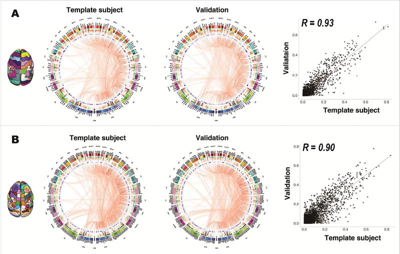
Figure 6. Structural connectomes of the atlases.
(A) Structural connectome of the MRI-based atlas. For demonstration purposes, the connectomes were thresholded at a 20% network sparsity to remove potential false-positive edges with low connectivity probabilities, and only the edges of the right hemisphere are displayed. (B) Structural connectome of the connectivity-based atlas. The same probability thresholds were applied. From left to right are the connectome of the template subject, the averaged connectome of the other four validation animals, and the correlation of all connectivity probabilities between the connectome of the template subject and the averaged connectome of the validation animals. For the connectome graph, each color-coded column represents one brain region and a red line represents an edge between two brain regions. The thickness and the color depth represent the connectivity probability of each edge, where a thicker line and a darker color mean a higher probability. The heatmaps show network features, including regional volume (green), degree centrality (red), weighted strength (orange), betweenness centrality (blue) and cluster coefficient (purple), where a darker color means a higher value.

