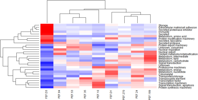
Figure 5.
Protein abundance in Rhipicephalus microplus ovaries. Heat map of NSAF data for each protein is expressed as a per cent of total NSAF per group within each category. Z-scores were calculated and used to generate heat maps as described in Material and Methods section. Red colour indicates proteins of high abundance and blue colour indicates proteins of low abundance. Dendrogram on the left shows protein clustering according to functional annotation.

