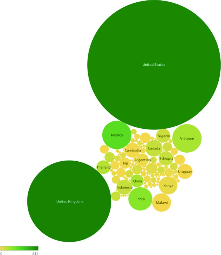
Fig. 3.
Bubble graphs highlighting the bias in the SRA dataset to the USA and UK due to their large surveillance programmes. The size of the bubble indicates the relative number of genomes listing that country as their collection source and the colour of the bubble indicates the number of distinct serovars reported from that country.

