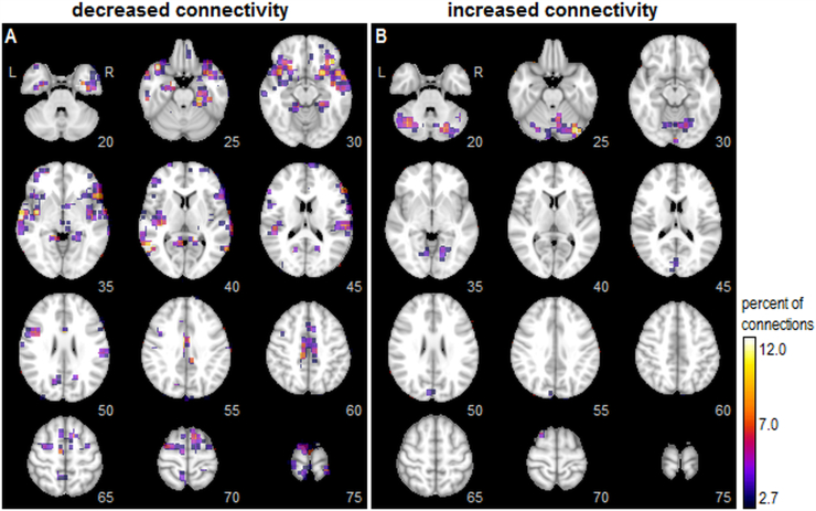
Fig. 1.
Univariate whole-brain analysis of functional connectivity correlates with symptom severity. For each node (voxel), the color map indicates the percentage of all pairwise connections to other nodes in which connectivity strength is significantly correlated with symptom severity scores (bootstrapped p-values, at an FDR of 0.05). The brain maps separately show regions where greater symptom severity is correlated with (A) decreased connectivity and (B) increased connectivity. Maps are thresholded to show the top 10% of voxels with the greatest number of significant connections. (For interpretation of the references to color in this figure legend, the reader is referred to the web version of this article.)

