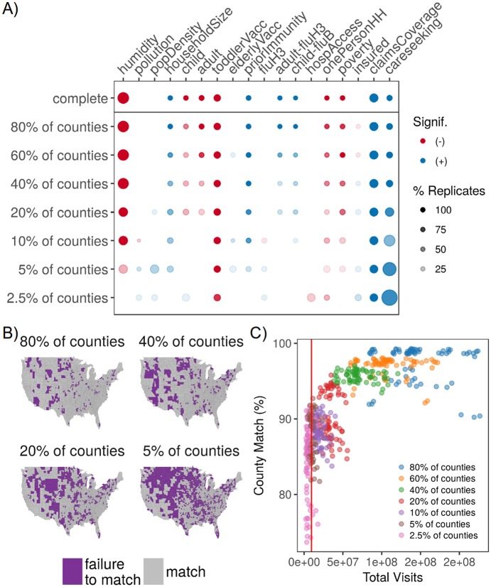
Fig 4. Optimizing design of sentinel surveillance systems.
A) Diagram indicating changes to model inference as fewer fixed-location sentinels reported data. Color indicates directionality of the significant effect (blue is positive, red is negative) while greater transparency indicates a lower percentage of replicates with a significant effect (for models with missingness); dot size represents the magnitude of the posterior mean (or average of the posterior mean across replicates). Predictors with no significant effect across the sequence of models were removed for viewing ease, and absence of a dot means the effect was not significant across any replicates. B) Map of model prediction match between the complete model and the 80, 40, 20, and 5% reporting levels for fixed-location sentinels. Match between the complete and sentinel models were aggregated across 70 season-replicate combinations (7 seasons * 10 replicates). Color indicates match between posterior predictions in the missing and complete models (purple represents a failure to match in at least 10% of season-replicate combinations). Failure to match means that the interquartile ranges for two posterior distributions failed to overlap with each other C) Scatterplot of county match percentage between the complete and sentinel models versus the total volume of medical claims visits. Each point represents a single season-replicate combination, and colors represent the reporting level of the fixed-location sentinels. The dashed line indicates the average visit volume in CDC’s ILINet during the study period, and it corresponds roughly with the 5% reporting level for our medical claims database.

