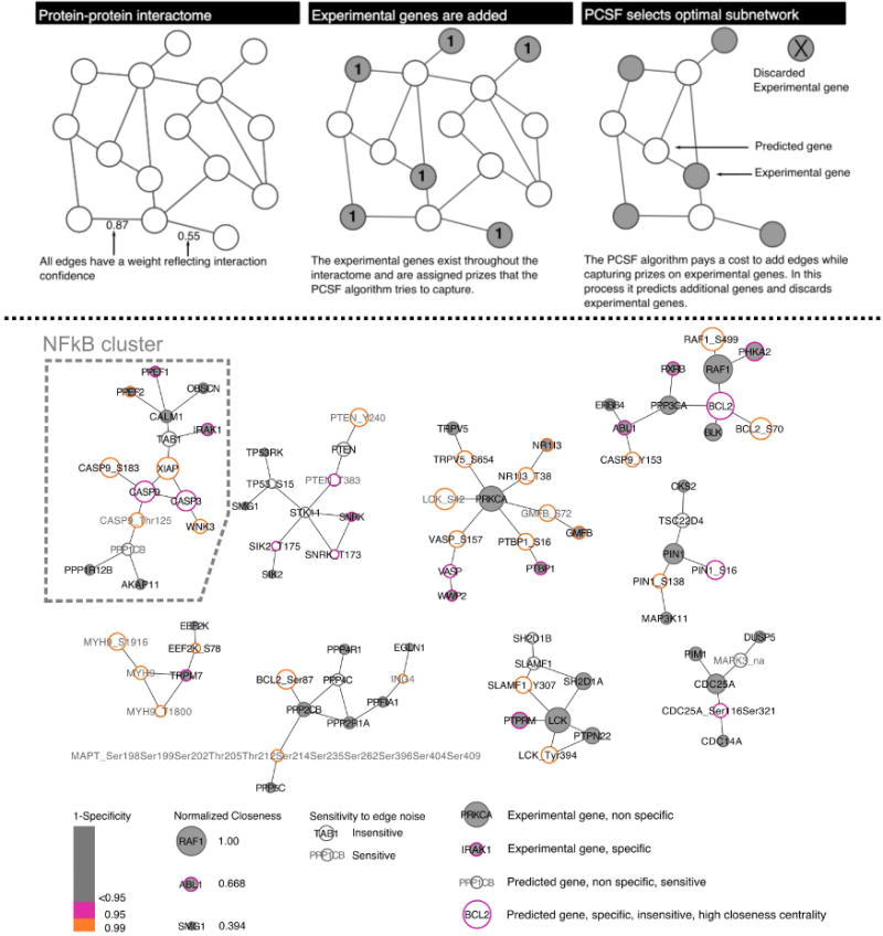
Figure 3. PCSF identifies TGFα shedding regulatory network.

(Top panel) The cartoon schematic represents how PCSF selects an optimal sub-network. Interaction edges are aggregated from multiple databases and all edges are scored (two shown for simplicity). Prizes are assigned from experimental data; in our case prizes were assigned to genes selected by shEnrich. The algorithm weights the cost of adding edges with capturing prizes in selecting an optimal network. (Bottom panel) The optimal, clustered network contains 86 genes and 83 edges. Grey face coloring indicates genes selected from the original experimental data set; white face represents predicted gene (genes and phospho-sites) selected by the algorithm. Gene border represents specificity to randomization (pink<=0.1; orange<=0.05), and gene size represents closeness centrality (larger genes are more central and more robust). Grey gene labels indicate genes that are sensitive to edge noise. Genes on the far right of the legend below the networks are annotated examples to help interpret all of their network properties. The cluster associated with NFkB signaling is highlighted.
