Fig. 2.

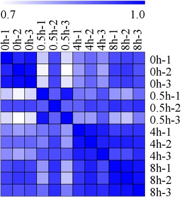
Heat map representation of the correlations coefficient between each two samples. The color represents the correlation coefficient (the darker the color, the higher the correlation, the lighter the color, the lower the correlation)

Heat map representation of the correlations coefficient between each two samples. The color represents the correlation coefficient (the darker the color, the higher the correlation, the lighter the color, the lower the correlation)