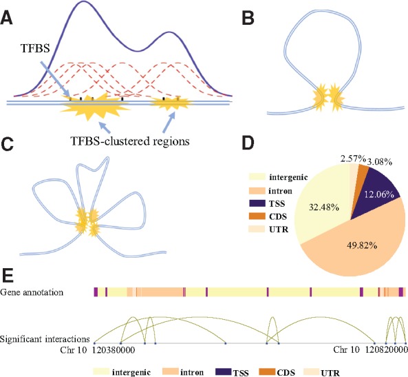
Fig. 1.

Identification of TFBS-clustered regions and SATs. (A) Identification of TFBS-clustered regions. Gaussian kernel density estimation was used to identify regions where TFBSs were clustered. (B) Typical structure of an SAT. Yellow markings represent pairs of spatially adjacent TFBS-clustered regions. (C) Typical structure of mSATs. Four yellow markings represent multiple TFBS-clustered regions spatially adjacent to each other. (D) Illustration of relative genome positions between SATs and genes. Different colors represent distinct gene annotations. Distant TFBS-clustered regions (blue dots) near gene promoters connected by curves represent SATs. (E) Genome-wide distribution of TFBS-clustered regions in proximal promoters (defined as 1-kb upstream and downstream of TSS), exons, introns, CDSs and intergenic regions for the H1 cell line
