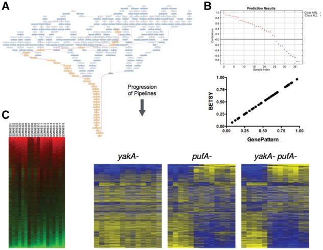
Fig. 3.

Reproduction of prior analyses. (A) This graph shows the workflow that can reproduce the cancer classification problem reported in (Golub et al., 1999). In contrast to Figure 2A, the inputs here are shown at the top of this network, and the pipelines flow downward to the output at the bottom. The dark blue nodes represent modules, and the light blue ones indicate data. The highlighted yellow nodes show the pipeline given the input files (green). (B) (Top) The predictions for the classes based on the pipeline published in the original manuscript. (Bottom) This scatter plot compares the scores predicted from the GenePattern (x-axis) pipeline following the original manuscript, with the scores from the pipeline produced by BETSY (y-axis). (C) These heatmaps (but not the labels) were generated using pipelines from BETSY. The one in the left panel is a reproduction of Figure 5 in Loh et al. (2006), and right panel Figure 1C in Van Driessche et al. (2005)
