. 2018 Feb 16;7:e32992. doi: 10.7554/eLife.32992

Figure 2. A: representative maps of the two extreme ends (identified based on the low and high extremes along a linearly spaced vector that spans the full range of subject CCA scores) of the CCA mode of population covariation continuum are shown for the default mode network (DMN, the PFM mode that contributed most strongly to the CCA mode of population covariation).

The top row shows that the inferior parietal node of the DMN differs in shape and extends into the intraparietal sulcus in subjects who score high on the positive-negative CCA mode (right), compared with subjects who score lower (left). The bottom row shows that medial prefrontal and posterior cingulate/precuneus regions of the DMN differ in size and shape as a function of the CCA positive-negative mode. The representative maps at both extremes are thresholded at ±2 (arbitrary units specific to the PFM algorithm) for visualisation purposes (the differences are not affected by the thresholding; for unthresholded video-versions of these maps, please see the Supplementary video files. The grey contours are identical on the left and right to aid visual comparison and are based on the group-average maps (thresholded at 0.75). Spatial changes of all PFM modes can be seen in the Supplementary video files and in Figure 2—figure supplements 27. B: difference maps (positive - negative; thresholded at ±1) are shown to aid comparison. C: A summary of topographic variability across all PFM modes, showing PFM correlations with CCA subject weights (at each grayordinate the maximum absolute r across all PFMs is displayed). An extended version of C is available in Figure 2—figure supplement 7. Data of Figure 2 available at: https://balsa.wustl.edu/8lVx.

Figure 2.

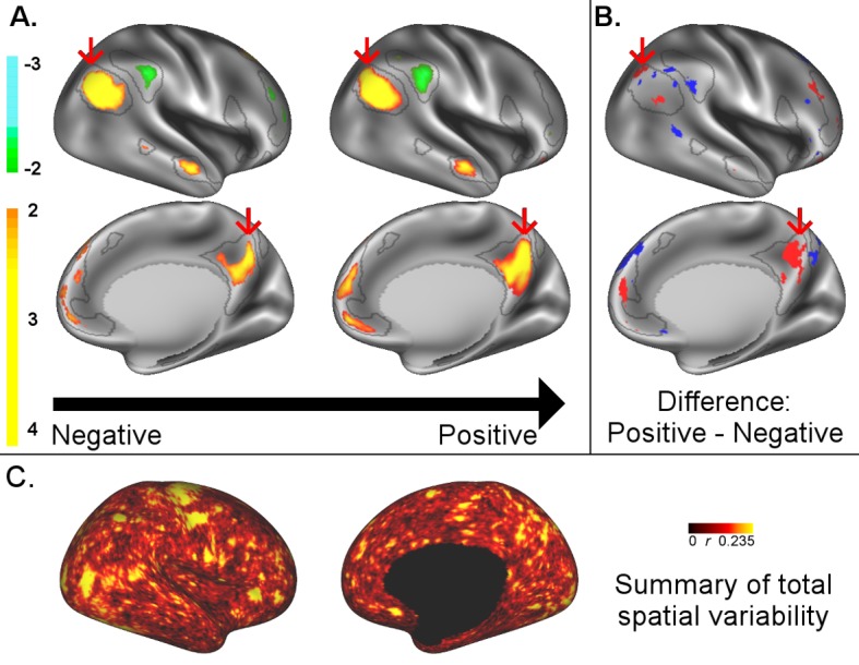
Figure 2—figure supplement 1. Representative maps of the two extreme ends of the positive-negative continuum for five PFMs.

Figure 2—figure supplement 1.

Maps can directly be compared between the left (negative) and the middle (positive), and difference maps are shown on the right (blue = negative > positive; yellow = positive > negative). Arbitrary thresholds used for visualisation purposes (same thresholds for all maps), see videos for the unthresholded continuum. Gray outlines are based on group average maps and are identical between left and right images to facilitate comparison. Data available at https://balsa.wustl.edu/07pz, https://balsa.wustl.edu/21kq, https://balsa.wustl.edu/rKMN, https://balsa.wustl.edu/xK16, https://balsa.wustl.edu/PGw5.
Figure 2—figure supplement 2. Representative maps of the two extreme ends of the positive-negative continuum for five PFMs.

Figure 2—figure supplement 2.

Maps can directly be compared between the left (negative) and the middle (positive), and difference maps are shown on the right (blue = negative > positive; yellow = positive > negative). Arbitrary thresholds used for visualisation purposes (same thresholds for all maps except map 15, where lower thresholds were used), see videos for the unthresholded continuum. Gray outlines are based on group average maps and are identical between left and right images to facilitate comparison. Data available at https://balsa.wustl.edu/KMGg, https://balsa.wustl.edu/Nq9K, https://balsa.wustl.edu/G1mN, https://balsa.wustl.edu/LBLx, https://balsa.wustl.edu/pKwg.
Figure 2—figure supplement 3. Representative maps of the two extreme ends of the positive-negative continuum for five PFMs.

Figure 2—figure supplement 3.

Maps can directly be compared between the left (negative) and the middle (positive), and difference maps are shown on the right (blue = negative > positive; yellow = positive > negative). Arbitrary thresholds used for visualisation purposes (same thresholds for all maps), see videos for the unthresholded continuum. Gray outlines are based on group average maps and are identical between left and right images to facilitate comparison. Data available at https://balsa.wustl.edu/9qw5, https://balsa.wustl.edu/kKxK, https://balsa.wustl.edu/07m9, https:// balsa.wustl.edu/21gB, https://balsa.wustl.edu/rKw9.
Figure 2—figure supplement 4. Representative maps of the two extreme ends of the positive-negative continuum for five PFMs.

Figure 2—figure supplement 4.

Maps can directly be compared between the left (negative) and the middle (positive), and difference maps are shown on the right (blue = negative > positive; yellow = positive > negative). Arbitrary thresholds used for visualisation purposes (same thresholds for all maps), see videos for the unthresholded continuum. Gray outlines are based on group average maps and are identical between left and right images to facilitate comparison. Data available at https://balsa.wustl.edu/xKwn, https://balsa.wustl.edu/PG0X, https://balsa.wustl.edu/7B1G, https://balsa.wustl.edu/6M1K, https://balsa.wustl.edu/16mg.
Figure 2—figure supplement 5. Representative maps of the two extreme ends of the positive-negative continuum for five PFMs.

Figure 2—figure supplement 5.

Maps can directly be compared between the left (negative) and the middle (positive), and difference maps are shown on the right (blue = negative > positive; yellow = positive > negative). Arbitrary thresholds used for visualisation purposes (same thresholds for all maps except map 20, where lower thresholds were used), see videos for the unthresholded continuum. Gray outlines are based on group average maps and are identical between left and right images to facilitate comparison. Data available at https://balsa.wustl.edu/5g1G, https://balsa.wustl.edu/nKVP, https://balsa.wustl.edu/gKkP, https://balsa.wustl.edu/Mlpw, https://balsa.wustl.edu/Brql.
Figure 2—figure supplement 6. Representative maps of the two extreme ends of the positive-negative continuum for five PFMs.

Figure 2—figure supplement 6.

Maps can directly be compared between the left (negative) and the middle (positive), and difference maps are shown on the right (blue = negative > positive; yellow = positive > negative). Arbitrary thresholds used for visualisation purposes (same thresholds for all maps), see videos for the unthresholded continuum. Gray outlines are based on group average maps and are identical between left and right images to facilitate comparison. Data available at https://balsa.wustl.edu/lK0L, https://balsa.wustl.edu/qK7x, https://balsa.wustl.edu/jK9z, https://balsa.wustl.edu/wKjp, https://balsa.wustl.edu/4nL6.
Figure 2—figure supplement 7. Comparison of the cortical representation of associations with behaviour across fractional area, HCP_MMP1.0 individual subject parcellation and PFM spatial maps.

Figure 2—figure supplement 7.

(A) Correlations between fractional area and behaviour were highly consistent between left and right hemispheres, and revealed relatively high correlations in higher order sensory and cognitive regions. Specifically, bilaterally significant (FDR corrected p<0.05) positive associations between larger surface area and higher scores on the positive-negative mode of population covariation were found in area POS2 of the parieto-occipital sulcus and in area IPS1 of the dorsal visual processing stream; bilaterally significant negative correlations were identified in the cingulate motor area 24dv, premotor area 6 r, and inferior parietal cortex (areas PFt, PFm, PGi). (B) Qualitative comparison between the spatial localisation of strongest correlations with behaviour across all three datasets reveals that many regions that contribute strongly in either the HCP_MMP1.0 or in the PFM individual subject spatial estimates spatially overlap or adjoin cortical areas in which fractional surface area was also closely linked to behaviour. This qualitative finding suggests that differences in regional surface area may drive many of the results presented in this work, although further research is needed to confirm this interpretation (for visual comparison the PFM correlation maps are shown using a higher threshold pFDR <0.0001, |r| > 0.218, and HCP_MMP1.0 correlation maps are correlated at pFDR <0.05; |r| > 0.159). (C) Un-thresholded HCP_MMP1.0 correlations with CCA subject weights; these are the maximum absolute r across all parcels, and therefore do not contain the parcel structure itself. (D) Un-thresholded PFM correlations with CCA subject weights (maximum absolute r across all PFMs). The cortical localisation of strong associations with behaviour do not closely overlap between PFMs and the HCP_MMP1.0 parcellation (i.e. red and blue regions in B and un-thresholded maps in C/D). This lack of exact correspondence of the representations of cross-subject variability may reflect differences between the HCP_MMP1.0 and PROFUMO models (the former being a hard parcellation with no overlap between parcels, and the latter being a soft parcellation that includes complex and often overlapping networks), and differences in the data types driving the parcellation (PROFUMO being driven by rfMRI data only, and the HCP_MMP1.0 parcellation being driven by data from multiple different modalities). Data available at https://balsa.wustl.edu/mK28.