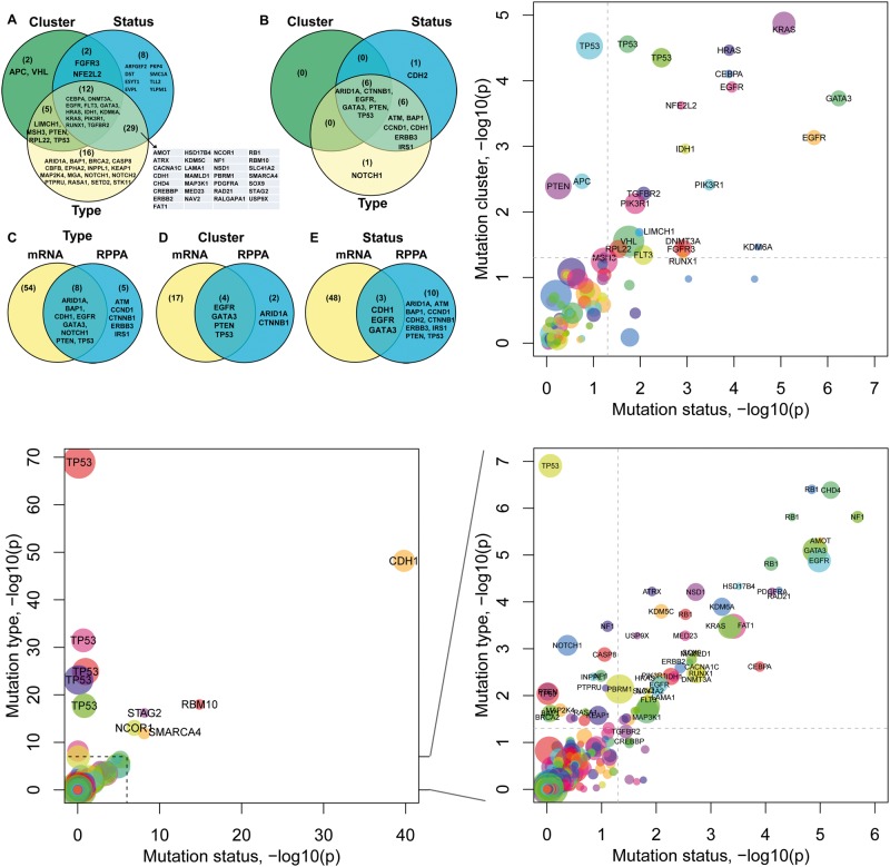
Figure 2.
Overview of mutational impacts on gene expression. (A and B) Venn diagrams showing genes associated with each mutation feature based on their mRNA expression (A) and protein expression (B). (C–E) Comparison of genes associated with mutation types (C), mutation clusters (D) or mutation statuses (E) at the mRNA level and at the protein level, respectively. (F) Plot of the impact of mutation clusters versus the impact of mutation statuses. Each dot represents a gene in a cancer type. Node color indicates cancer type, e.g. TP53 was found in multiple cancer types. The x-axis and y-axis show the negative log10 P-values for each gene obtained from the regression models in which the mutation status of a gene predicts its mRNA expression (x-axis) or its mutation cluster predicts its mRNA expression (y-axis), respectively. The dash line indicates where P = 0.05. (G–H) Plots of the impact of mutation types versus the impact of mutation statuses (G), and its zoom-in view (H). The x-axis shows the negative log10 P-value of the regression model fitted for each gene in which the gene’s mutation status predicts its mRNA expression. The y-axis shows the negative log10 P-value obtained using a gene’s mutation type to predict its mRNA expression. P-values shown are after multiple testing correction. A colour version of this figure is available at BIB online: https://academic.oup.com/bib.

