. 2018 Mar 6;7:e31730. doi: 10.7554/eLife.31730

Figure 1. Dynamics of food accumulation in a starved colony.

(a) A single frame from a video of a colony in the course of food accumulation. Ant identity is presented as a unique number next to her tag, and the fluorescent food is presented in red. The right side of the image is an IR-covered nest, and the left side is a neighboring open yard that includes a food source and a water source. In this frame a forager can be seen feeding from the food source (ant 207), and a trophallactic event between ants 203 and 421 is magnified. (b) Global food accumulation (normalized fluorescence), F(t), is plotted in black. The accumulated food brought by each forager, fi(t) is plotted in a unique color. The dashed line is the predicted colony state according to Equation 3 for m=0.6×10⁻⁴, as estimated from Figure 1c. (c) The time-averaged global inflow, dFdt, as a function of F(t), is plotted in the black solid line. Time-averaged flows through individual foragers, dfidt, are plotted in unique colors (same as in panel b). Flows were calculated by differentiating the colony state and the contributions of each forager (the curves from Figure 1b) with respect to time (see Methods, Data Analysis). Colored circles on the global plot depict each forager’s first return from the food source. The black dashed line represents Equation 2, where m was calculated as follows: the flow through each forager was fit with an equation of the form dfidt=mi(1-F(t)), and m was taken to be the average of all mi. Results from all three experimental colonies can be found in Figure 1—figure supplements 1 and 2. Source files for panels b and c are available in Figure 1—source datas 1 and 2.

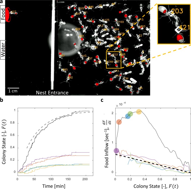
Figure 1—source data 1. Trophallactic interactions.
This data also relates to Figures 2, 3 and 6.
elife-31730-fig1-data1.xlsx (121.7KB, xlsx)
DOI: 10.7554/eLife.31730.006
Figure 1—source data 2. Temporal data.
This data also relates to Figures 2 and 6.
DOI: 10.7554/eLife.31730.007

Figure 1.

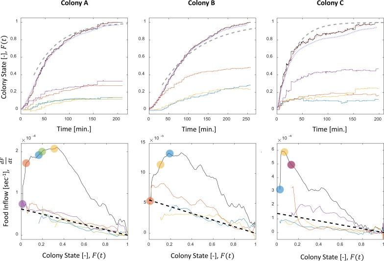
Figure 1—figure supplement 1. Food accumulation dynamics in all three experimental colonies.

Figure 1—figure supplement 1.

Food accumulation (top row) and food inflow (bottom row) of each experimental colony (columns). The results of Colony A are presented in Figure 1 in the main text, where a detailed explanation can be found in the caption. The smoothed data of accumulated food, which is referred to as ‘colony state’ in all other analyses, and from which the food inflow was derived (see Methods, Food flow), is presented in the red dotted curve. The blue dotted curve is the integral of the obtained food flow. This was plotted to validate the method of differentiation that was used to derive the food inflow (see Methods, Food flow).
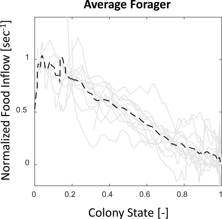
Figure 1—figure supplement 2. Food flows through individual foragers and their average.

Figure 1—figure supplement 2.

All food flows through individual foragers from all three observation experiments (gray solid lines) were normalized such that dfidt(t=0)=1, to account for scale differences between experiments. The average of all normalized flows (black dashed line) is highly linear with the colony state. Most foragers, despite starting to forage at different times, do not greatly deviate from this straight line.