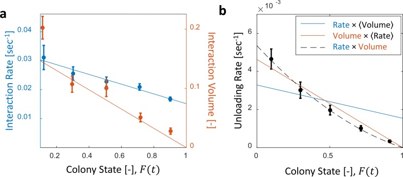
Figure 2. Interaction volume is the dominant component of unloading rate.
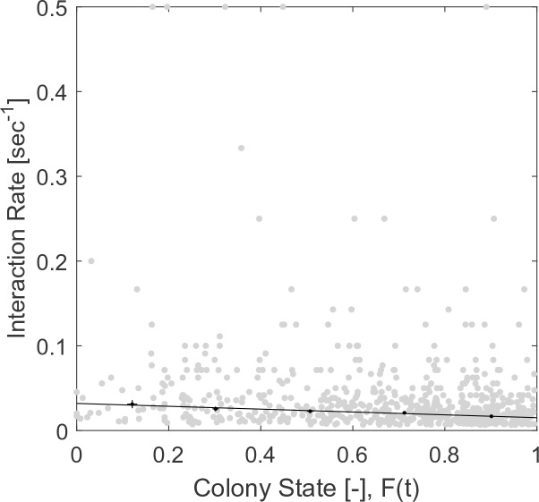
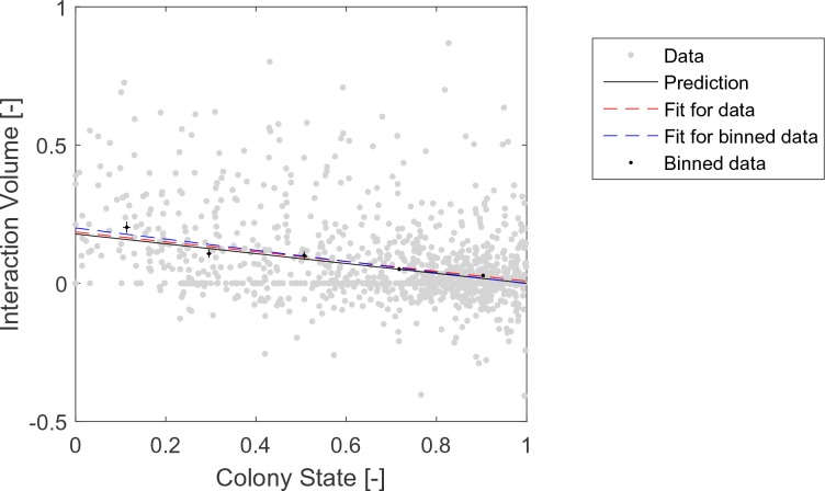
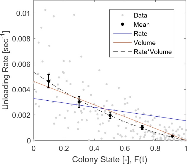
(a) Interaction rate (blue) and interaction volumes (red) both decline with increasing colony state. Binned data is presented by mean SEM. Interaction rate was calculated as the inverse of all intervals between interactions. The intervals were binned according to the colony state at which they occurred (n = 49, 79, 101, 170, 240 for bins 1–5, respectively. See Figure 2—figure supplement 1 for raw data and Figure 2—source data 1 for binning sensitivity analysis). Blue line depicts a linear fit , . Interaction volumes were measured in units of pixel intensities, normalized between experiments (see Methods, Data Analysis), and binned into equally-spaced colony state bins (n = 84, 137, 165, 274, 496 for bins 1–5, respectively. See S4). Red line represents the predicted relationship between the mean interaction volume and the colony state from Equation 9, with and as obtained from the fit in Figure 3a. (b) Foragers’ unloading rates at each visit in the nest were binned according to colony state (black, mean SEM for each bin, n = 26,26,28,39,57 for bins 1–5, respectively). Mean unloading rate values were fitted by three functions: the blue line represents a model which includes the effect of interaction rates only (, function obtained from fit in panel a, ), the red line represents a model which includes the effect of interaction volumes only (, function obtained from fit in Figure 2—figure supplement 2, ), and the black dashed line represents a model that incorporates the combined effects of interaction volumes and interaction rates (, ). All panels in this figure represent pooled data from all three observation experiments. For raw data see Figure 2—figure supplement 3. Source file is available in Figure 1—source data 1.


