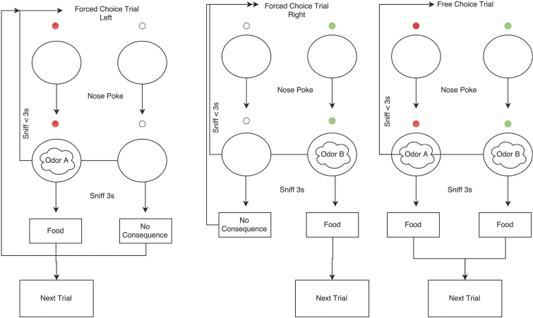
Figure 2.
Diagram of the different trials for the odor preference assessment. Left shows a forced trial to the left, center a forced trial to the right, and right shows a free-choice trial. Circles represent the odor port. Small circles represent illuminated LEDs that were correlated with odor presence/absence.

