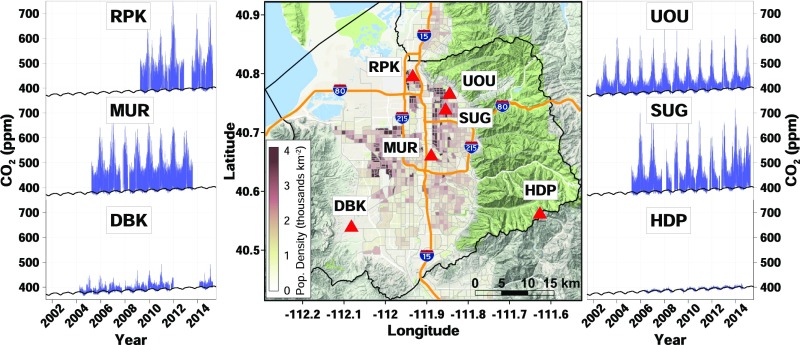
Fig. 1.
SLV carbon dioxide measurement network. Time series show hourly averaged CO2 mole fractions (blue) and the background CO2 mole fractions derived from Carbon Tracker and the HDP site (black, SI Appendix). Population density is superimposed on the map and the black outline indicates Salt Lake County.

