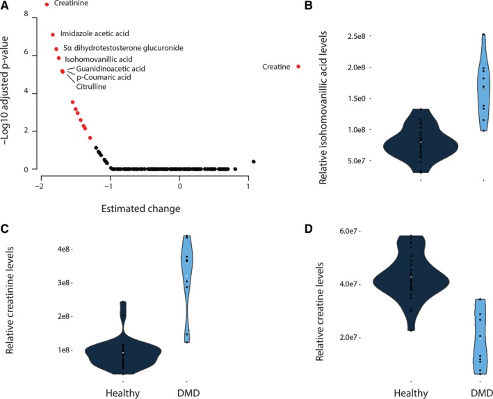
Figure 1.

Comparison of metabolites serum levels in DMD and healthy controls. (A) Volcano plot showing the deviation in patients compared to controls (x axis) and the −log10 of the adjusted P‐value on the y axis. Black circles represent metabolites with adjusted P‐values below the significance threshold after Bonferroni correction, while red circles represent the 15 metabolites surviving multiple testing correction. (B‐D) Violin plots showing concentration changes for 3 metabolites, namely isohomovanillic acid, creatinine and creatine. Metabolite levels are shown for each patient as black dots, while the white dot represents the mean for each group
