
Fig. 6.
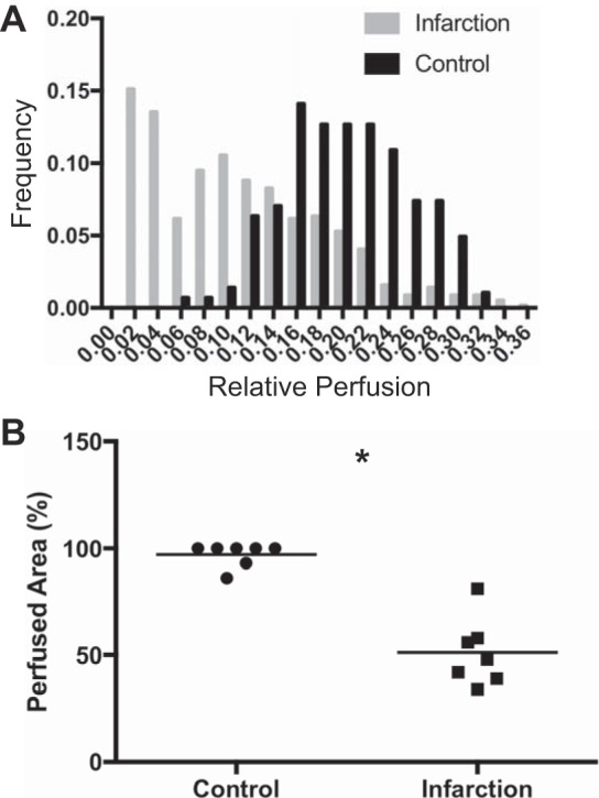
Comparison of relative myocardial perfusion. A: pooled histogram for control (black bars) and infarcted (gray bars) cohorts. B: scatter plot depicting area fraction of actively perfused myocardium area for each cohort. Bars represent mean of n = 7 animals/cohort. *P < 0.01 by Mann-Whitney.