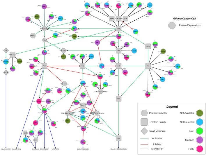
Figure 4.
The protein expression levels of glioma cancer cells mapped onto the GBM pathway map from the TCGA data set. In this diagram, The Human Protein Atlas database were used to obtain protein expression levels of glioma cancer cells. Special shapes used in the map represent different types of molecules which are given in the legend of the figure as protein complex, protein family, protein and small molecule, respectively. Lines and arrows show the relationship of the molecules. Each protein symbol (circle) is shown as pie chart to represent different expression levels of glioma cancer cell which are depicted in different colors. Olive for not available, deep sky blue for not detected, green for low expression, medium orchid for medium expression, and deep pink for high expression. The original GBM pathway map in the Cytoscape format was downloaded from (“The Cancer Genomics at cBio—Glioblastoma (TCGA)” n.d.).

