
Fig. 5.
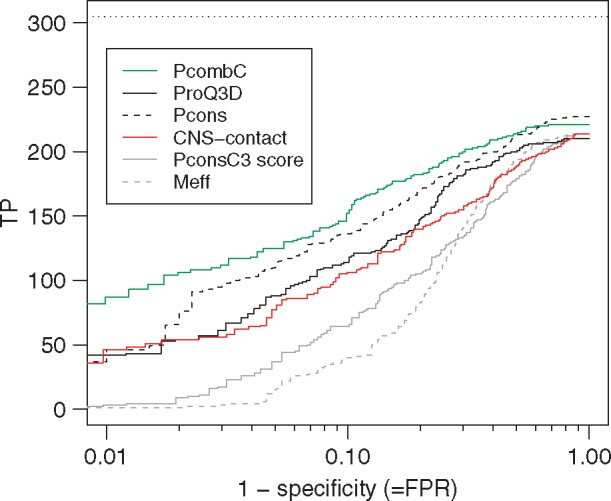
ROC-like plot for different ways of evaluating and ranking the models in the benchmark dataset. While the x-axis shows true positive rate on a logarithmic scale, the y-axis shows the number of proteins with TM-score ≥0.5. The horizontal line indicates the best possible outcome, i.e. the number of families with TM-score ≥0.5 when ranking the models by TM-score