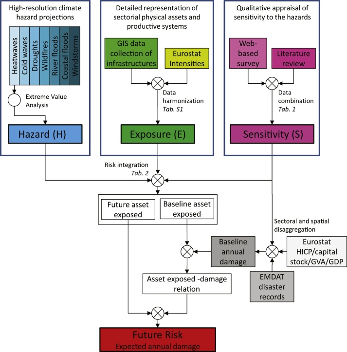
Fig. 1.
Schematic overview of the methodological approach. Components of hazard, exposure, and sensitivity are displayed in blue, green, and magenta, respectively, baseline annual damage (and related input datasets) in gray, and future risk of climate hazards in red. The flow diagram refers to a climate change scenario with static sensitivity and no changes in the distribution of infrastructures. Tables cited in italic (Table) are detailed in the main text and Supplementary material. (For interpretation of the references to colour in this figure legend, the reader is referred to the web version of this article.)

