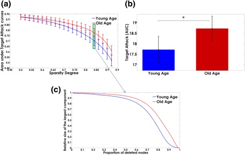
Figure 10.

Panel (a) shows the dependence of the “area under targeted attack” on the sparsity degree. The error bars represent the standard deviation over the bootstrap samples. The areas under the “targeted attack” curves are represented in panel (b). The bar heights represent the mean values for the Young‐Age and Old‐Age groups and the error bars the standard deviations. The asterisks denote significant differences between groups. The Old‐Age group showed higher resilience after “simulated attacks” of the Myelin‐Net hubs (p < .05). Panel (c) represents the trajectories of the relative size of the largest components as the principal nodes are “deleted” (“attacked”) for the sparsity degree highlighted in panel a (green box) [Color figure can be viewed at http://wileyonlinelibrary.com]
