
Figure 4.
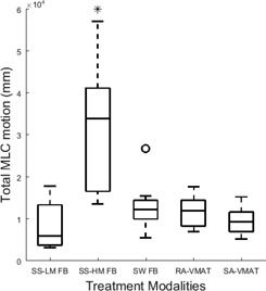
Box plot of the total MLC traveled in each plan in millimeters for all treatment modalities compared. For each plot, the median is displayed by the central line, the upper and lower border of the rectangle represent the 75th and 25th percentile or the interquartile range, and the whiskers represent the extreme data points not considered outliers. Outliers are illustrated by ‘o’ and significance is shown by ‘*.’