
FIGURE 4.
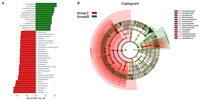
Distribution of microbiome was compared between two groups by using linear discriminant analysis (LDA) effect size (LEfSe). (A) Histogram of the LDA scores reveals the most differentially abundant taxa in two groups. The taxa listed in red represent group I and green describe group II. (B) The cladogram shows the significantly overrepresented bacterial taxa in group I (red area) and group II (green area).