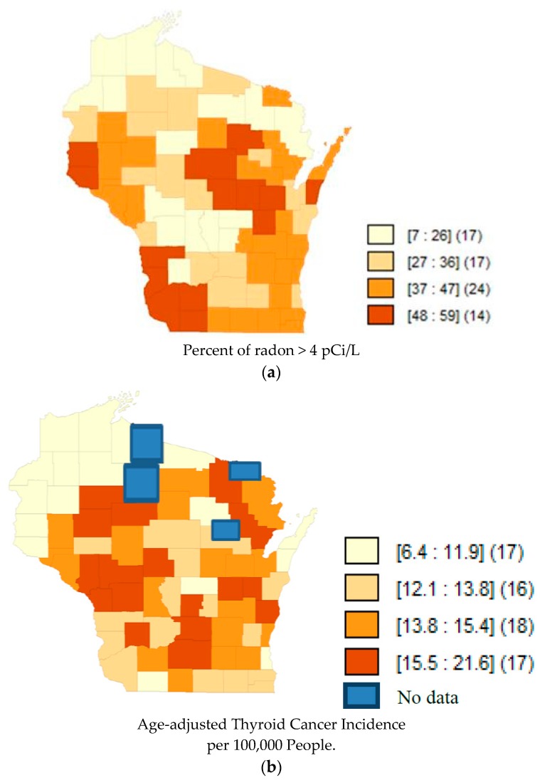
Figure 3.
(a) Map of Quartiles of Radon Concentrations in Wisconsin counties. Darker shades represent a higher percent of radon above 4 pCi/L. The numbers inside the brackets represent the range of percentages in that shade. The numbers inside the parentheses represent the number of counties in that quantile. Data accessed from AirChek, 2017. (b) Map of Quartiles of Age-adjusted Thyroid Cancer Incidence (1990–2013) in Wisconsin counties. Darker shades of orange represent higher rates of thyroid cancer incidence. The blue color represents the counties that lacked data from the public database. The numbers inside the brackets represent the range of incidence rates per 100,000 in that shade. The numbers inside the parentheses represent the number of counties in that quantile.

