
Figure 4.
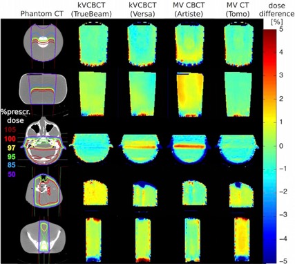
Dose difference maps. Percentage difference of simple dose plans based on kV CBCT, MV CBCT, and MV CT images compared to diagnostic kV CT‐based images. The left column bar shows the dose distribution within the CT image as percentage of the maximum dose. The columns to the right show the relative percentage differences where green is no difference, blue is underdosing, and red is overdosing on the linac's on‐board images.