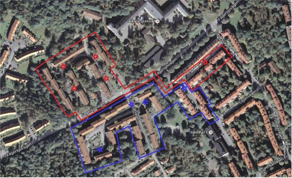
Figure 2.

Satellite picture of the research area. The blue area represents the treatment group, all the houses within that area got the information leaflet delivered to them. The red area represents the control group which got no information. The red and blue stars show where the sorting stations are located. Source: Google, Kartdata.
