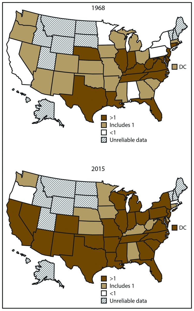
FIGURE 4.
Black-white heart disease mortality ratios* among adults aged ≥35 years — United States, 1968 and 2015
* State-level heart disease death rates were not calculated when <20 deaths occurred in the state within a group (blacks or whites) because the rates are considered statistically unreliable. Ratio categories are based on statistical testing using 95% confidence intervals (CIs). Black-white mortality rate ratios with CIs that include 1 represent approximately equal rates of heart disease deaths among blacks and whites. Ratios with upper CIs <1 indicate lower heart disease death rates among blacks compared with whites, and ratios with lower CIs >1 indicate higher heart disease death rates among blacks compared with whites.

