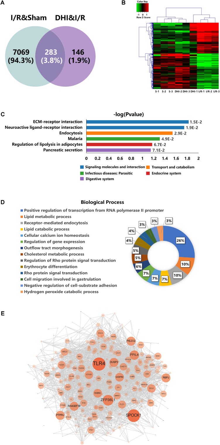
FIGURE 4.
DEGs profiling analyses. (A) Venn diagram summary of the DEGs between Sham versus IRI groups and DHI versus IRI groups. (B) Hierarchical clustering analysis and heatmap of the correlation coefficients between altered gene expression profiles. S1–3 represent the three biological replicates for Sham group, DHI1–3 for DHI group, and I/R1–3 for IRI group, respectively. (C) Top KEGG pathways enriched with DEGs and their corresponding p-values. (D) Doughnut chart presentation for the distribution of altered genes in biological processes. The individual biological process was distinguished with color and percentage value. (E) Protein–protein interaction network generated from GeneMANIA analysis. The size of each node presents the degree of connectivity in PPI network. Large node shares more connection to other nodes.

