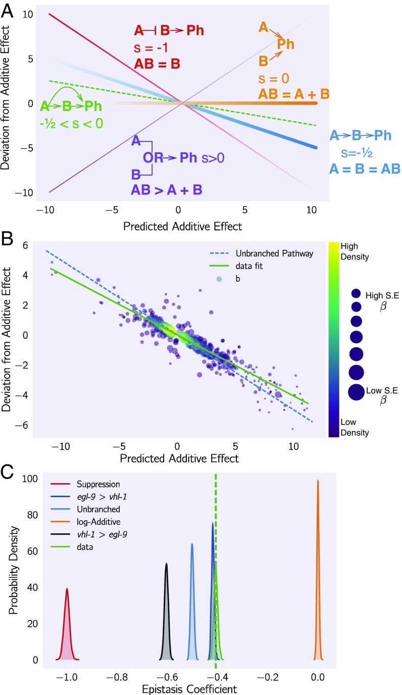
Fig. 5.
Quantification of epistasis transcriptome-wide. (A) Schematic diagram of an epistasis plot. The x axis on an epistasis plot is the expected coefficient for a double mutant under an log-additive model (null model). The y axis plots deviations from this model. Double mutants that deviate in a systematic manner from the null model exhibit transcriptome-wide epistasis (). To measure , we find the line of best fit and determine its slope. Genes that act log-additively on a phenotype (Ph) will have (null hypothesis, orange line), whereas genes that act along an unbranched pathway will have (blue line). Strong repression is reflected by (red line), whereas correspond to synthetic interactions (purple line). (B) Epistasis plot showing that the egl-9(lf); vhl-1(lf) transcriptome deviates significantly from a null additive. Points are colored qualitatively according to density (purple, low; yellow, high) and size is inversely proportional to the SE of the y axis. The green line is the line of best fit from an orthogonal distance regression. (C) Comparison of simulated epistatic coefficients against the observed coefficient. Green curve shows the bootstrapped observed transcriptome-wide epistasis coefficient for egl-9 and vhl-1. Dashed green line shows the mean value of the data. Simulations use only the single mutant data to idealize what expression of the double mutant should look like. means that the phenotype of is observed in a double mutant .

