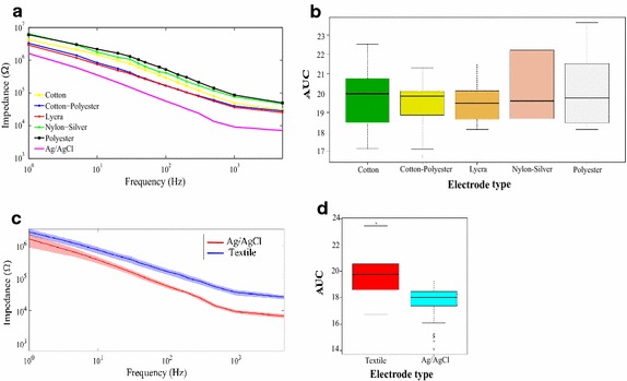
Fig. 8.

Contact impedance. a Average of the magnitude of the contact impedance of each material versus frequency. Each of the lines of the graph represents the average value of the magnitude of the contact impedance evaluated on the different test subjects. b Box and whisker plot with the value of the area under the curve (AUC) of each of the materials. The AUC is a numerical value that represents the value of the area under the curve of the impedance spectral signals. c Shadow plot of the contact impedance magnitude versus frequency: the solid line represents the average value, the shadow is the standard deviation of the values around the average. Textiles (blue), Ag/AgCl (red). d Box and whisker plot with the value of the area under the curve comparing textile versus Ag/AgCl electrodes
