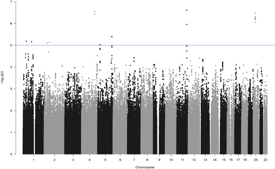
Fig. 2.

pQTL analysis of SNPs associated with the change in circulating ANGPTL3 during weight loss. Manhattan plot of pQTL analysis of SNPs associated with the change in circulating ANGPTL3 during weight loss. Each SNP is indicated by a black or a gray dot. They are arranged by chromosomal location (x-axis). The y-axis illustrates the level of statistical significance measured by the negative log of the corresponding p value for each SNP. The blue line represents suggestive association (p < 1 × 10⁻⁵)
