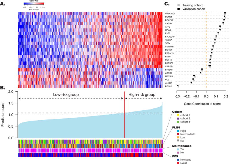
Figure 3. The gene expression-based predictor for FL patients tested in the validation cohorts.

The predictor is a linear combination of the log2-transformed normalized gene expression levels weighted by individual gene coefficients. A: The relative gene expression levels of the 23 genes in the predictive model are presented in the form of a heat map. Each column represents a single patient from the combined validation cohorts, arranged according to the predictor score, with lowest score on the left. Each row represents a gene from the model, ordered by gene contribution to the score. B: The score from the predictor for patients in the validation cohorts. The patients are arranged as in panel A. The vertical red line separates patients into high- (n=122, 27% of the patients) and low-risk (n=338, 73% of the patients) groups according to the threshold (horizontal line) determined in the training cohort. The clinical and treatment characteristics of the patients are depicted. Cohort 1 included patients from the PRIMA trial, cohort 2 from the University of Iowa/Mayo Clinic Lymphoma SPORE and cohort 3 from the Hospital Clinic University of Barcelona. C: The relative contributions of each of the 23 genes to score variation. The X axis position of the boxes represents the absolute average contribution of the genes (calculated as the mean expression in a given cohort, multiplied by the coefficient assigned to the gene in the score). The width of the boxes shows the contribution of each gene to the score variation (calculated as the standard deviation of the gene in the cohort multiplied by its coefficient). Gene contributions are presented in both the training cohort (grey) and the combined validation cohort (black).
