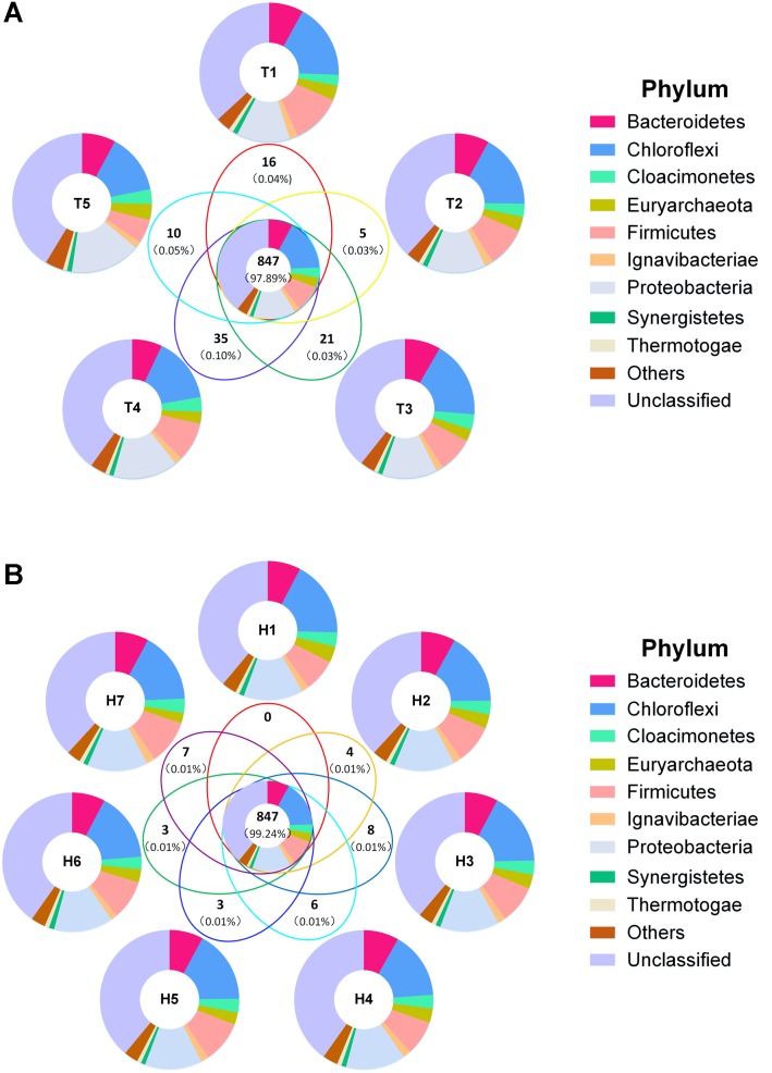
FIGURE 4.
Venn diagram of total OTUs. (A) Venn diagram of sample by time grouping. (B) Venn diagram of sample by height grouping. Bold numbers represented shared and unique OTUs numbers, numbers in brackets were average relative abundance. Different colors represented phylum distribution in corresponding parts.

