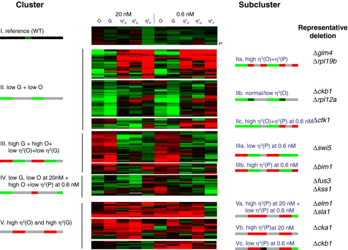
Figure 3. Cluster analysis of 50 genes identified as affecting variability and or pheromone response output.

Hierarchical clustering of values derived from flow cytometry measurements from 198 cell populations (19 replicates for reference strain SGA85, four independent segregants each for 17 deletions from the kinases or phosphatase set and three independent segregants each for 37 deletions from the unbiased set). We used the Pearson correlation metric to assess distance between strains and the average linkage method to form clusters. Before clustering, we first log‐transformed the data and then median centered each row (each strain). Each strain had the following 10 measurements (five after induction with 20 nM pheromone and five after induction with 0.6 nM pheromone): O (pheromone system output), G (gene expression output), and η2(O), η2(G) and η2(P), the three cell‐to‐cell variability measurements. The panel shows these values as a “heat map”, from red (higher than the median) to black (equal to the median) to green (lower than the median). The signature pattern for each cluster or subcluster is represented with a color bar with 10 blocks, one for each measurement (gray indicates that that the measurement may take any value). Rightmost column shows representative deletion strains for each subcluster. The asterisk next to the last row of the reference cluster indicates the data are from Δfus1, which did not differ from reference in this re‐assay. Appendix Table S3 shows the raw data and Appendix Table S4 lists the clustered, log‐transformed and median‐centered dataset. Appendix Table S6 shows microscope data that complement these flow cytometer data for 44 of these 50 mutant strains selected for clustering.Source data are available online for this figure.
