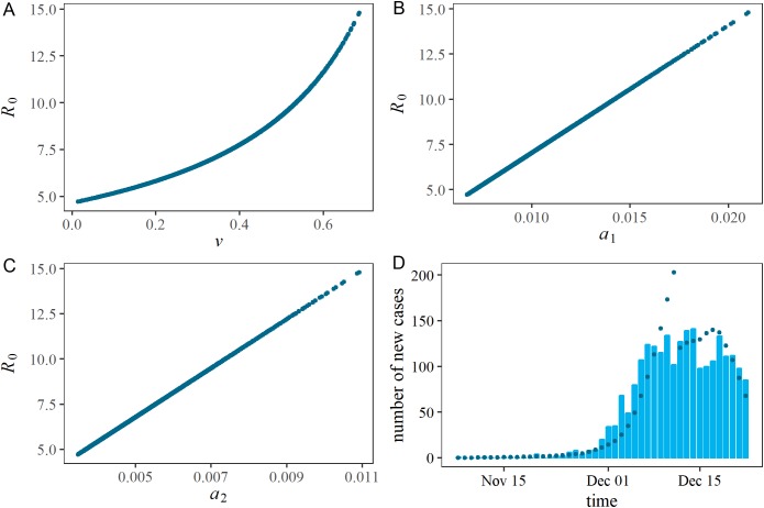
Figure 3. Estimated correlations in each pair of estimated parameters, and comparison between observed and predicted epidemic curves.
(A), (B) and (C) represent a two-dimensional plot of estimated parameters. During the Latin Hypercube sampling (n = 1,000), the vaccination coverage, ν, has a symmetric triangular distribution ranging from 0.0 to 0.7. (D) shows the comparison between observed and predicted epidemic curves. Bars constituting the epidemic curve show the observed data, while dots indicate predicted epidemic curve from Latin Hypercube sampling (n = 1,000).

