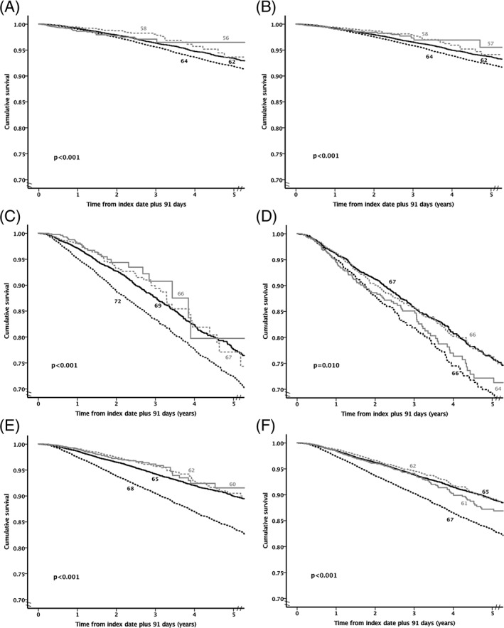
Figure 1.

Kaplan–Meier survival curves by glucose‐lowering regimen. A, Metformin monotherapy. B, Regimens with a low hypoglycaemia risk. C, Sulphonylurea monotherapy. D, Insulin monotherapy. E, Regimens with a higher hypoglycaemia risk excluding insulin. F, Regimens with a higher hypoglycaemia risk including insulin. Black dashed line = lower glycated haemoglobin (HbA1c; <7%), black solid line = moderate HbA1c (≥7% and <8.5%), grey dashed line = high HbA1c (≥8.5% and <9.5%) and grey solid line = very high HbA1c (≥9.5%). The number next to each line is the mean age for each cohort
