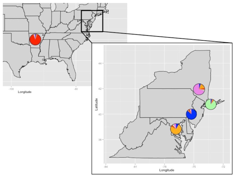
Figure 4. Admixture results by collection location.

Pie charts represent the average admixture from each geographically distinct putative population (Arkansas, Potomac River Basin, Upper Hudson River Basin, Lower Hudson River basin, Philadelphia) as noted in the admixture plot of Fig. 3.
