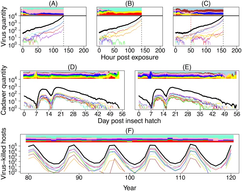
Fig 2. Simulations of the nested model.
In all panels A–F, colored curves represent the pathogen population sizes of different virus strains, and the black curve shows the total pathogen population size. The colored bar at the top of each panel shows the relative frequencies of virus strains over time. Panels A–C show 3 realizations of the within-host virus growth model. A reexposure event, marked by a dashed, vertical red line, is also shown in panel C. The top colored panel left of time 0 shows the frequency of virus strains in a cadaver that a host was exposed to at time 0 (and reexposed to at time 50 in panel C). Death occurs when the total number of virus particles within a host hits an upper threshold. To aid visualization, here we set the pathogen population size at host death to be 104, as opposed to the more realistic value of 109 that we use when comparing our models to data. The time of death differs between simulations due to demographic stochasticity in virus growth, and in each simulation it is marked by a dashed, vertical black line. Panels D and E show 2 realizations of our stochastic SEIR-type epizootic model starting from identical initial conditions. Note that the curves here show cadaver quantities rather than virus particles as in panels A–C. Epizootics are initiated by overwintered cadavers that infect emerging larvae. As these cadavers decay, total cadaver quantity drops to low levels, such that the pathogen population is almost entirely composed of virus particles inside living hosts. These hosts then die, initiating future rounds of infections. Panel F shows a realization of our between-generation pathogen model, with trajectories showing the total number of virus-killed hosts in each generation. The frequency of pathogen strains can drift over time, an effect that is particularly noticeable during troughs of infection. SEIR, Susceptible-Exposed-Infectious-Removed.

