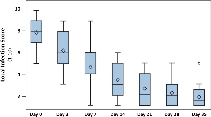
Figure 2.

CHANGE IN LOCAL INFECTION SCORE
Data are presented in box plots where the lower and upper borders of the box represent lower and upper quartiles of the data distribution, respectively. Diamonds represent mean values, and the bars in the box, the median of the data. Over time, the local infection score decreased steadily and significantly (P < .0001, Friedman test). Between day 21 (visit 4) and 35 (visit 6), chronic ulcers had healed in 37% of patients.
