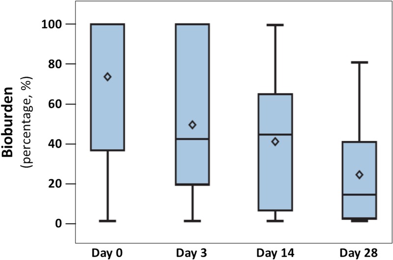
Figure 3.

CHANGE IN BIOBURDEN
Data are presented by box plots where the lower and upper borders of the box represent lower and upper quartiles of the data distribution, respectively. Diamonds represent mean values, and the bars in the box, the median of the data. Over time, the percentage of bioburden covering the wound decreased steadily and significantly (P = .0009, Friedman test).
