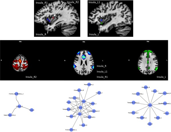
Figure 8.

The upper panel shows the location of the insular nodes. The middle panel shows the meta‐analytic connectivity modeling (MACM) associated to these nodes (p < .001 cluster‐level corrected for multiple comparison). Nodes are associated on the basis of their patterns of connectivity. The lower panel shows the first‐step nodes of the morphometric co‐atrophy network connected to the insular nodes pertaining to each connectivity pattern [Color figure can be viewed at http://wileyonlinelibrary.com]
