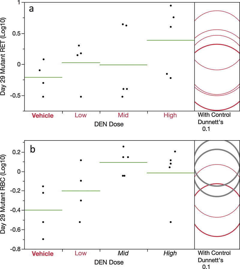
Figure 3.
Frequency of day 29 mutant reticulocytes (panel a) and mutant erythrocytes (panel b) are graphed for each of four DEN treatment groups. Data for individual rats are shown, and group means appear as horizontal green lines. Note that the mutant cell frequencies (per million total cells) have been log transformed. Dunnett’s test results are shown to the far right of each graph, where statistically significant differences relative to the concurrent vehicle control group appear as italicized black text as opposed to red text, and by a grey circle as opposed to a red circle. Circles’ diameters represent 95% confidence intervals.

