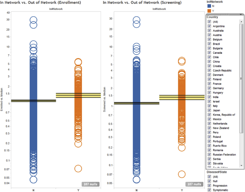
Fig. 5.
Normalized screening (right) and enrollment (left) investigator performance averaged over all clinical protocols they participated in. Each circle represents a unique investigator. Orange and blue circles indicate in-network and out-of-network investigators, respectively. The horizontal lines and yellow bands indicate the mean and 95% confidence intervals, respectively.

