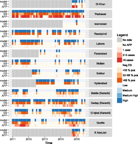
Fig. 3.

Time-series data and model output for each district included in the analysis, January 2011 to August 2015. AFP cases (red boxes, lower rows) and ES (orange boxes, middle rows) vary in time, and these data can be compared to estimates of the probability that a district is infected (blue boxes, upper rows). Grey areas indicate that environmental sampling had not been initiated within the district
