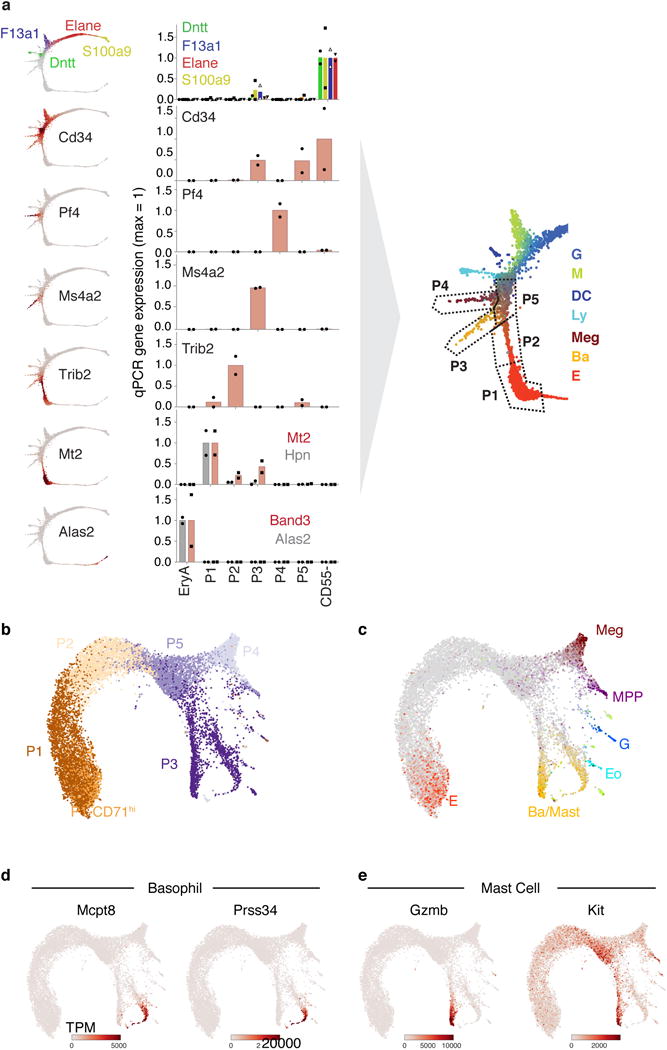
Extended Data Figure 3.

Mapping HPC subsets P1-P5 to the Kit+ SPRING plot by RT-qPCR and scRNA-seq
a Subpopulations P1 to P5 map onto specific regions of the SPRING plot. On the left are SPRING plot heat maps for a panel of marker genes; on the right are corresponding measured expression for each of the marker genes by RT-qPCR, performed on sorted cell subsets P1 to P5, and on EryA (= cells undergoing ETD2). A cartoon illustrates the mapping of each of P1 to P5 onto the SPRING plot based on the RT-qPCR results. Bars are mean of n= 2 independent experiment (circles, triangles or squares). Expression is shown normalized to β-actin mRNA.
b,c SPRING plot of single-cell transcriptomes from freshly sorted P1-P5 subsets (Fig. 2a–b). Cells are colored by sorted subpopulation (b) or by expression of lineage-specific marker genes (c) (Supplementary Table 7).
d,e SPRING plots of P1-P5 subset cells, colored by expression of basophil (d) and mast cell (e) marker genes. The larger cell number of cells in the P3 region of the graph resolves a split between the two lineages that was not observable in the original Kit+ dataset.
