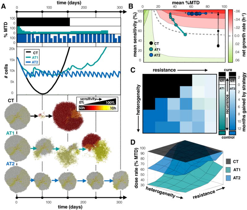
Figure 5.

Comparing treatments when tumor cells migrate. A) Comparing CT, AT1, and AT2 treatments using a tumor from a pre-growth normal distribution of s=100% and σs=25%. Dose schedules, population dynamics, and spatial layout at various time points are shown for each treatment. See the Supplement for animation (Movie 5). B) Trajectories for average sensitivity vs. average dose over time. C) Winning strategies, and D) Average dose for different initial tumor compositions. See Figure 4 caption for more details on each panel.
