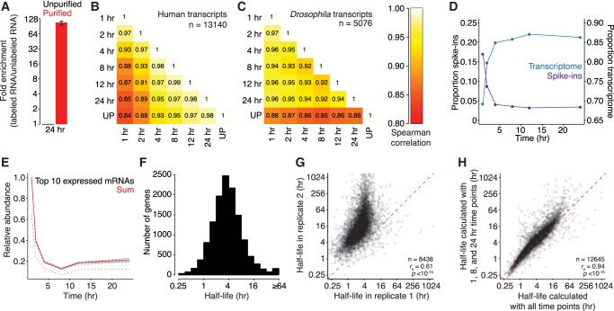
FIGURE 2.
Exogenous, whole-organism spike-ins can be used to calculate transcript half-lives. (A) Enrichment of 4SU-labeled transcripts. Plotted is the mean enrichment of Drosophila S2 RNA compared to yeast RNA for purified 24-h samples (red) relative to unpurified (black) samples for two biological replicates. The black line represents range. (B) Comparisons of human transcript abundance between samples. A heatmap is plotted comparing the abundance of human transcripts in each purified sample, as well as the unpurified (UP) sample. Values in each box are Spearman correlations. (C) Comparisons of fly mRNA abundances between samples. As in B, except for transcripts encoded in the Drosophila genome. (D) Ratios of fly to human reads through the time course. The fraction of reads mapping to the human (blue) or Drosophila (purple) genome is plotted for each time point. (E) The behavior of individual Drosophila genes. Plotted is relative abundance for each of the top 10 most highly expressed genes (dashed lines) and the sum of reads mapping to these genes (in red). (F) Distribution of half-lives in human cells. The histogram shows the distribution of half-lives in human cells for 12,890 genes. (G) Comparison of half-lives between biological replicates. A scatterplot comparing human transcript half-lives for two biological replicates. The red dashed line represents the x = y line. (H) Half-lives calculated using only three time points. A scatterplot comparing half-lives calculated by using all time points or only three (1, 8, and 24 h). The red dashed line represents the x = y line. See also Supplemental Figure S1.

