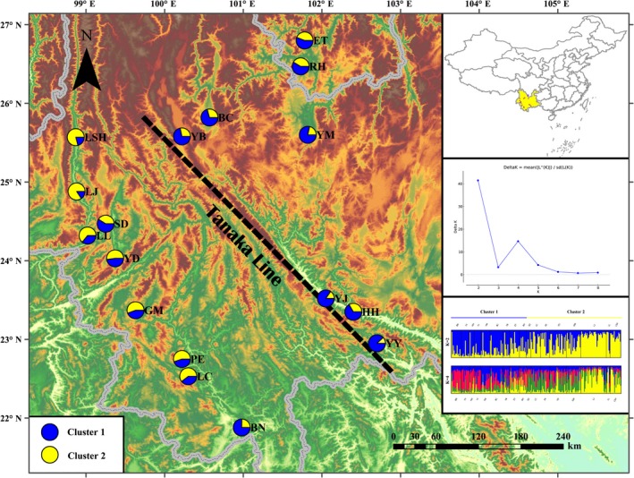
Figure 4.

STRUCTURE clustering analysis results for B. ceiba populations based on their geographic distribution. Colors represent the population's probability of populations belonging to either of the two clusters, where blue represents cluster 1 and yellow represents cluster 2. The right‐hand figure shows the number of clusters (K) determined for the B. ceiba populations analyzed was the highest peak that was at K = 2. Each vertical bar in the histogram represents a population
