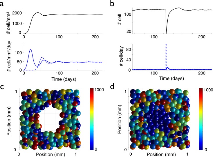
Fig 3. Evolution of the cell density, with and without a lesion.
The graphs in (a) display the temporal evolution of the cell density (up) and the density per day of proliferating (bottom, blue curve) and differentiating (bottom, red curve) cells, when starting the simulation with one cell. In (b), a lesion is made at time t = 125 days: all the cells inside a sphere of 250 μm radius centered at the center of space, are killed (see (c)). The graphs in (b) display the temporal evolution of the cell number (up) and the numbers of proliferating (bottom, blue plain curve) and disappearing (bottom, blue dashed curve) cells per day inside the sphere corresponding to the initial lesion, see (c) (average over 20 simulations, the error bars are not represented to avoid overloading the figure but they can be estimated from the amplitude of the fluctuations). In (c) and (d), the color of the cells is correlated with the value of their lifetime clock (with a maximum lifetime threshold of 1000 h). In (c) and (d), in order to be able to see the lesion, only a 200 μm thick slice centered at the origin is represented. In (c), the system is represented just after the 250 μm radius lesion. (d) The lesion is filled up after 33 days of evolution by the migration and the proliferation of the cells at the border of the lesion. The newly formed cells or migrating cells that have reset their clock by loosing their contact with the neighboring cells inside the perimeter of the lesion appear in blue.

