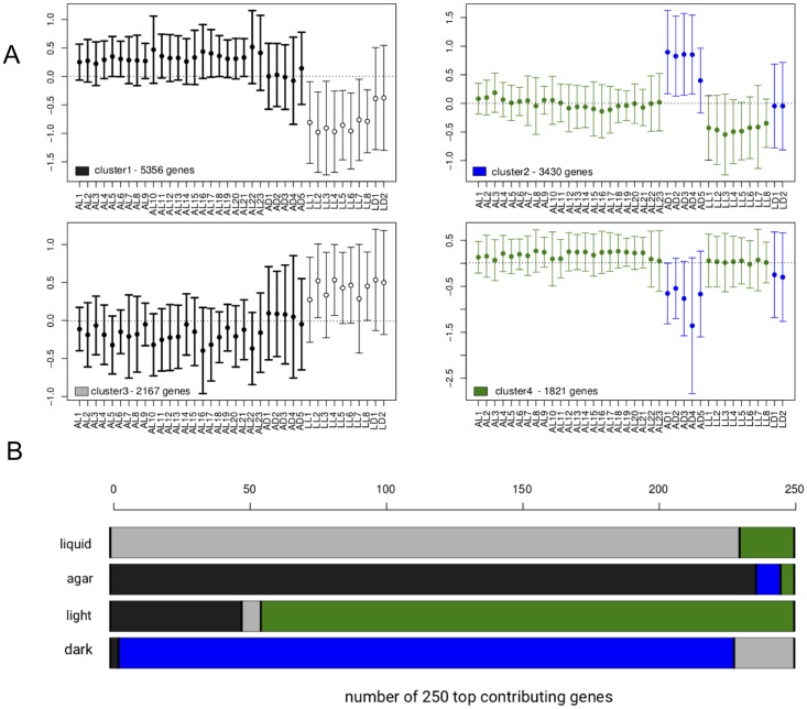
Fig 5. Comparison of top-contributing genes according to surprisal analysis and K-means clustering of transcripts.
(A) Centroid plots with mean and standard deviation of the expression values [Ln(meancenteredFPKM)] of the different genes belonging to the different clusters for each sample. Agar-upregulated (cluster 1, black), dark-upregulated (cluster 2, blue), light-upregulated (cluster 3, grey) and liquid-upregulated (cluster 4, green). (B) Cumulative barplot describing how many of the 250 most contributing genes to the different phenotypes described according to the first 2 constraints (see Fig 1) belong to the 4 different clusters according to K-means clustering. The same color code as in (A) is used for representing the samples corresponding to the different phenotypes.

